WALLFLOWER CATALOGUE FILE.033 : Tsugu minä perhonen
Someday, My Butterflies
The other day, I visited the 'tsugu minä perhonen' exhibition at the Matsumoto City Museum of Art.
Minä perhonen, celebrating its 30th anniversary this year, is a brand known to anyone interested in fashion or design. Its color palettes and motifs evoke cherished childhood memories, its intricate embroidery is lavishly applied, and its textiles possess rich textures. The clothing and accessories, which express a fantastical worldview using these elements, have captivated discerning individuals since the brand's inception. I recall that around 2000, girls eagerly carried minä's mini bags and iconic egg-shaped bags.
Cute things never quite suited me, and minä perhonen felt like an extravagance for me to wear. While admiring it as wonderful, I spent years only vaguely understanding its philosophy. However, this exhibition, which conveys the essence of "creating" through minä perhonen's craftsmanship, was far more wonderful and memorable than I imagined, not just for long-time fans of the brand, but for anyone involved in creation or expression. How many times did I sigh in admiration and reflection, thinking, "This is how designing and creating something was originally meant to be..."
The official catalog for this exhibition is a substantial read, almost like a textbook on design. It allows you to revisit the thoughts and details embedded in each textile, much like touring the exhibition venue. It also includes transcriptions of intriguing video interviews with people from various fields about "tsugu" (to connect/succeed), which were shown at the venue (the catalog also features an exclusive interview with Shinro Ohtake).
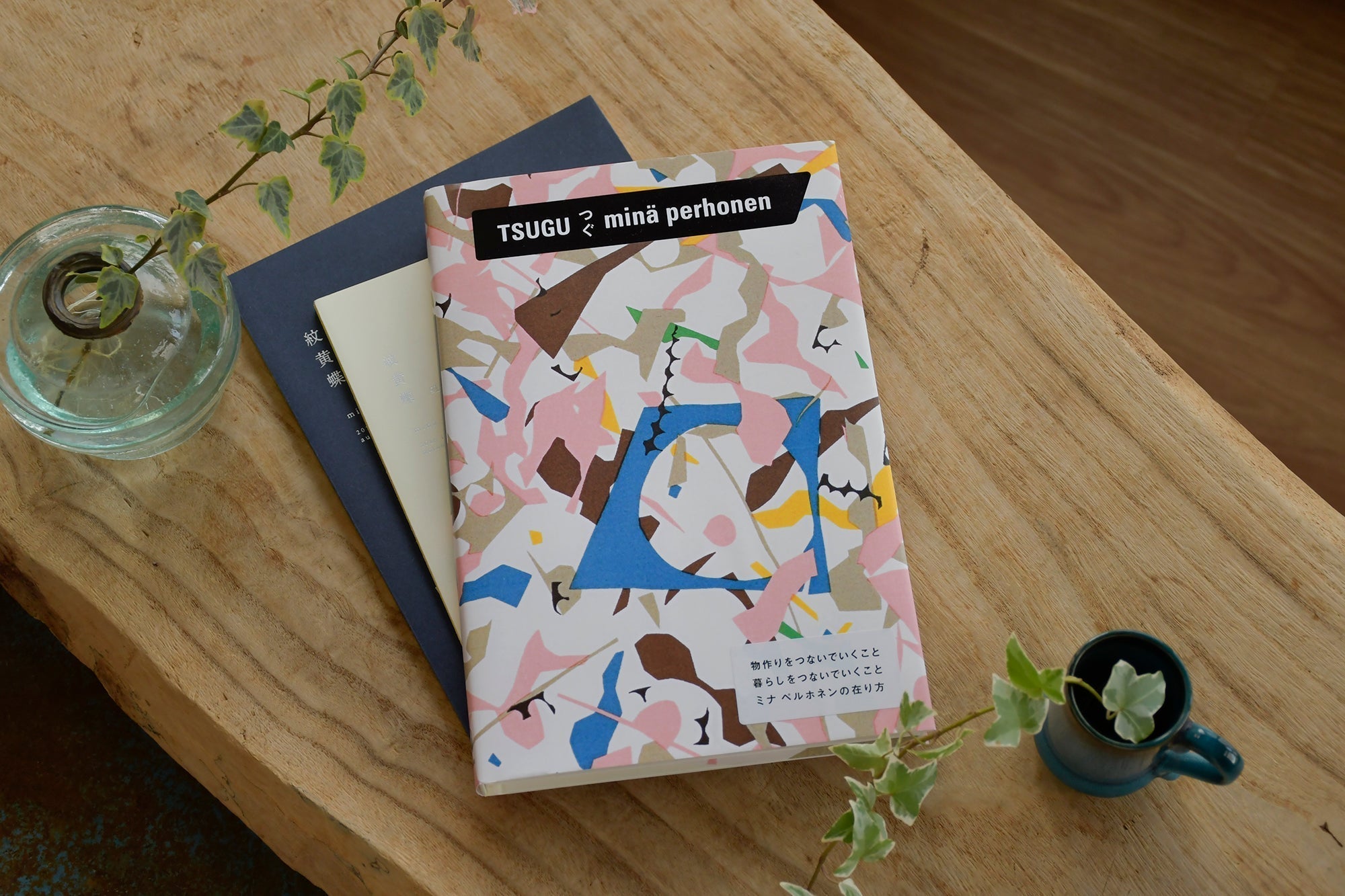
There are eight types of covers in total, including a venue-exclusive one. For me, this "surplus" pattern seemed highly epoch-making for the brand and within the exhibition's narrative, so if I were to pick one up, it had to be the standard edition! No other choice was conceivable.
Can you instantly imagine the story behind this pattern's birth? The free and lovely abstract-like pattern had always left an impression on me, but learning how it came to be was an eye-opener, a bit of a shock. Scraps of paper, cut off while making another pattern with paper cutting and destined for disposal, were reborn as a new pattern. Even if one might conceive of such an idea, the actual execution of it in their work and its beautiful realization is truly impressive.
While you can glimpse it in the catalog, and explanations of each textile can be read on minä's official website, I felt that the original artwork really needed to be experienced firsthand at the exhibition, absorbed with both eyes and heart.
Especially over the past decade, the widespread availability of convenient tools has made design accessible to everyone. With AI generating plausible images, price erosion in design fees is also occurring. Now that it's easy to "imitate surfaces and create something similar," I feel that the word "design" is becoming increasingly superficial.
However, minä perhonen continues to be supported by its unique creations, which run counter to such societal trends and norms. They value the individual sensibility and insights of the designer, generate ideas through hands-on work, spare no effort in the process, and make no compromises on details. Furthermore, they consider how to connect the surrounding technologies and people involved and the state of society. This is what gives the brand its value, making it impossible to imitate superficially.
This stance is also somewhat punk. The essence of minä hasn't changed at all; I believe that the world simply became different, inverted, while they were ordinarily and carefully engaging with things and working with the wish for those who held their creations to be happy.
The "sleeping flower" textile, inspired by the photo 'Woman with a Flower' taken by photojournalist Marc Riboud (which was also displayed at the venue, depicting a woman offering a flower to a soldier pointing a rifle), and "alive," born from the question of bears descending into human settlements and environmental issues, particularly conveyed this punk spirit of disobedience and environmentalism.
While possessing a distinct, unique presence, delightful cuteness, and high quality, they maintain a gentle, correctly disobedient attitude. In a society where compromise is often forced, especially in corporate work, seeing the strength to continue crafting with conviction truly invigorates one's spirit.
And those clothes and accessories, as they are worn and lived in by people, become a soft art that approaches completion over time. Someday, I too want to wear textiles that resonate with my heart and live that work, my own story. High-quality clothing, not just cute, but refined in every detail, seems like something I can finally wear in my own style now that I'm an adult.

tsugu minä perhonen
Artwork: Kaoru Kasai (Art Direction)
Format: hard cover
product no.(ISBN): 978-4-86831-019-8
_

|
Text & Photos / Fumika Arasawa Designer |
_
WALLFLOWER CATALOGUE
Designer Fumika Arasawa introduces one captivating artwork each time.
Updated once a month (on the first day of the first of the 24 solar terms of that month).
Bookmarks and archives are available here.